

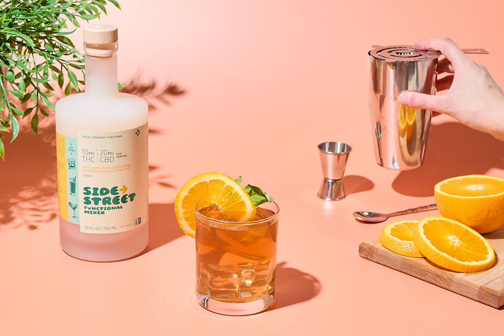
How Brand Imagery Boosts Cohesion and Attraction in Paid Ads
- Carrington Crothers

- Feb 14, 2025
- 5 min read
You’re here to get better performance from your paid ads, correct?
You need to know what makes some advertisements stand out while others get overlooked. The secret? Brand imagery.
The first thing people notice about your ad is the image before reading your amazing headline and copy. The visual element determines whether people will want to explore more content.
Carrington discussed with Seth Avergon who is the CEO of Avergon Marketing Group about how product images function in paid advertising. Seth shared excellent advice on how images can increase conversion rates.
This article will cover:
How images set the tone for your brand
Matching images to copy for cohesion
Choosing images that attract and resonate
AB split testing different image options
Maintaining visual branding across the funnel
Let's dive in!
Product Images Evoke the Emotional Response
When you scroll through Instagram you encounter a paid advertisement about a serene lake. It feels peaceful, calm. Then you read the headline: Intense Bootcamp Workouts.
Wait, what?
The disconnection between image and text creates a disruptive effect. This does not match your expectations. And there is an inherent disconnect.
As Seth explains:
"Images create feeling around a brand. The first thing people see is that image. It either attracts or it doesn't."
Images set the tone. And in one glance, it tells whether your brand is:
Playful
Luxurious
Down to earth
Edgy
Words need more time to absorb. Images work directly on emotion. They simply seem true or false.
Choose photos that activate the instincts you desire. Don’t just display your products. The ad shows what customers experience when interacting with your brand.
Suppose you own a bohemian clothing store. Choose airy, light and laidback focused imagery.
Do you design luxury watches for a living? Go for bold, elegant visuals.
Establish the tone early with purposeful imagery. When someone visits your site they gain trust because of the familiarity your brand creates.
Align Product Photographs to Text for Consistency
Here’s another big takeaway from Seth’s interview:
"Images should match copy. No car wrecks with beach vacations!"
Makes sense, right? But it's easy to overlook.
For maximum impact your ad should have a headline, copy, call to action and images that work together. Magic happens when you understand how each part fits into the bigger picture.
Run beach photos alongside travel ads. Relaxing spas with wellness adverts. Feature hungry families with food-smeared kids. You get the idea.
Pick product photos that support both the headline and the ad's text. It reinforces your message and provides cohesion.
This approach simply leads to confusion for people and weakens the advertising results. The tone seems discordant, chaotic.
When choosing images for your brand always pick visuals that align thematically and emotionally with your existing branding. Consistency is important!
Make Use of Attractive and Resonating Images
"Images pull people into the ad. They create that initial hook of attraction."
Images have the power to trigger your emotions and primal instincts.
But don’t simply pick a pretty picture. Select visuals that connect directly with your audience. The audience connects with them on such a deep level.
For example, show:
Happy families and kids (for parents)
Luxury cars and watches (for high-income earners)
Diverse friend groups (for young people)
Viewers usually find these types of visuals extremely attention-grabbing. More important, they signal: These ads communicate to viewers that they were designed for people who share their characteristics.
Building personal connections makes people curious about who you are. The use of images creates this personal hook right from the beginning.
AB Split Test Different Images to See What Performs
How do you choose winning images when you don’t know which ones will succeed beforehand?
No worries. You can AB split test them.
As Seth explains:
“Test five variations of your ad by changing both images and copy content. See what garners the most interest.”
Create several ads with varying images. For each element send some traffic. Examine which images generate higher clicks and more conversions.
The data should guide your choice. Image selection no longer needs to be a guessing game.
Because here's the reality:
Images that win hearts in October might lose their appeal by November. Audiences eventually wear out on stock photography.
Running AB split tests continuously remains essential. Rotate through different images to maintain ad freshness over time.
Carry Your Brand Imagery through the Funnel
Your paid ads now include the precise branded design you need. But don't stop there!
In Seth's words:
“Maintain uniformity of imagery throughout the funnel. Images must be consistent on landing pages as well as advertisements."
Show relevant images after a click. Design your funnel in a way that visitors can move through it without any hassle.
Your travel advertisements need pictures that show people relaxing on the beach. Place more beachgoers in your landing page display.
We understand and rely on this principle because we have repeatedly observed it. Your visitors get reassured when they notice your branding displayed all around.
Making a sudden switch from your visual branding tactics creates an uncomfortable disruption for users. The effect appears somewhat misleading because it operates in such subtle ways. Maintaining cohesion throughout the customer journey from initial ad view until the final conversion.
Practical Tips for Using Brand Imagery in Paid Ads
Want to put this into practice? Here are some practical tips:
Know Your Audience
What do they care about? What do they want? Your images should speak directly to the things people want.
Test It Out
Don’t think you know what works. Test various images and headlines together with different copy to identify the most effective combinations.
Keep It Cohesive
The narrative of your image needs to align with your headline and copy.
Evoke Emotion
The best imagery sparks emotion in people. All forms of emotions including joy, excitement and curiosity trigger action.
Stay Consistent
Brands must maintain uniform graphic designs across all marketing channels. This platform helps build familiarity and trust with users.
Real-World Example
Let's move forward with an example that we will analyze step by step. Imagine you are marketing a travel package to Hawaii.
You could use:
Image 1: A couple relaxing on the beach
Headline: “Escape to Paradise”
Copy: “Unwind on the pristine beaches of Hawaii. Your dream vacation awaits.”
Image 2: A couple dancing at a sunset party
Headline: “Experience the Nightlife”
Copy: “From sunset cocktails to beachside parties, Hawaii comes alive after dark.”
Image 3: A couple exploring a tropical jungle
Headline: “Adventure Awaits”
Copy: “Discover the hidden treasures of Hawaii’s lush landscapes.”
Each ad appeals to a different desire. Relaxation. Nightlife. Adventure.
Testing different image variations reveals which visual elements your audience relates to best.
Key Takeaways
Let’s review what you’ve learned so far:
Your images are what people see first in ads so they need to be high-quality!
The tone of the copy needs to match the tone of the images for cohesive branding.
Choose images which create visual interest and emotional connection
Test different images for your AB split to find which ones generate the most conversions.
Keep visual branding consistent through the funnel
People think in images. Images speak more than words.
Leverage this with your paid advertisements. Audiences who view agenda-driven visuals make better-informed decisions.
About the Expert
Would you like to talk more about how imagery contributes to branding? Reach out to Seth Avergon.
Receive direct messages from Seth who works at Avergon Marketing. He serves as a fractional CMO and agency CEO advisor.
Keep up with Seth on LinkedIn and check out his posts on AvergonMarketing.com.
Looking to learn more on the photography side - contact Carrington Crothers of Prospect Street Studio, en ecommerce photography agency based just outside of Boston MA


Comments